WELCOME TO THE BLOG
A collection of musings about everything from art to UX
Disclaimer: The thoughts shared in this blog are solely my own and do not represent the perspectives of my professional relationships or clientele.
23 items found for ""
- Pocket UX case study: Theme park ride wait times app
Hello and welcome to another Pocket UX post. These mini UX/UI app designs are just for fun and to keep my skills sharp! The Dinosauria Park app allows park visitors to discover which rides have the shortest lines, so they can maximize their time - and fun! 🦕 Project Info Duration: 2-3 days +/- Concept client: Dinosauria Park Role: UX / UI Designer Mediums: Figma, Procreate Problem Statement “When I go to a theme park, I want to be able to see which rides have the shortest lines, so I can go on as many rides as possible.” Overview Dinosauria Park is a popular amusement park in California with many dinosaur-themed exhibits, rides and tours. At approximately 200 acres, the on-going challenge visitors have is to know which rides have the shortest lines, so they can go on as many rides as possible during their ticketed day. As the famous Dr. Ian Malcolm said in Jurassic Park (1993) “Life finds a way.” 🦕 Design Process I maximized results by researching as deeply as I could before a sketch hit the paper, or a pixel ended up on the screen. Even though this product design challenge had a quick turnaround, I would have still followed the same process structure should it had been a greater amount of time. 1. Empathize 2. Define 3. Ideate 4. Design / Prototype 5. Test / Feedback ★ Empathize Competitive Analysis There usually is not much competition when dinosaurs are involved — but I began by studying competitors. There were a handful of amusement park apps I wanted to learn from. I created a list of features users might appreciate by listing them across other designs. High-level competitive analysis between existing apps in the marketplace. User Research and Pain Points I analyzed reviews for various apps which gave me a good foundation to identify must-have features. Most importantly, I was able to see users preferred a less complicated, or process heavy design. There were many complaints about the apps draining phone batteries which is never a good thing when spending all day in the park. ★ Define Project Goals After gaining some clarity into user needs and how existing apps had flaws to address, I gathered my research and created a pocket-sized list of project goals. I wanted to: • Create a clear, visual hierarchy of ride wait times • Build a robust system which would allow users to see attractions located on a map, view wait times, save attractions as favorites, and have the ability to book a fast pass to hold their spot in line. • Use a light-weight, native OS app Task Flow Due to the quick-paced nature of this product design challenge, I chose to create a high-level flow for the specific task of viewing ride wait times. ★ Ideate Sketches / Wireframing I had a few ideas for screens outside of the established task flow, but ultimately chose to move forward with the sketches necessary to convey the goal of the original task completely. ★ Design / Prototype UI Kit / Mini Style Guide To give the design a natural and prehistoric feel, I chose to stay within shades of green and yellow. I drew inspiration from the valleys of Hawaii which so often evokes imagery of dinosaurs roaming the earth. I had designed the logo in a previous project and it lent itself well in this case. Hi-fi screens The following screens were built in Figma for iOS language. Dinosauria Park screens: sign up, map view and list view Dinosauria Park: map view Dinosauria Park screens: ride details ★ Test / Feedback I posted this project online and asked for feedback and advice for the UI. The final screens took their feedback into account and it increased the usability. In specific, the use of color-coding the wait times. Results & Lessons Learned Overall, this pocket-sized product design exercise was really eye-opening for me. It came with its own set of challenges which set me out on the hunt for more information. I’d love to revisit this project in the future to gather more feedback, build out more screens and of course… research… and more research. Forever learning. Disclaimer: The thoughts shared in this blog are solely my own and do not represent the perspectives of my professional relationships or clientele.
- Pocket UX case study: Supplement recommendations app
Hello and welcome to another Pocket UX post. These mini UX/UI app designs are just for fun and to keep my skills sharp! TruVitamin is a concept app which would offer supplement recommendations for easy purchase. Project info Duration: 1-2 days +/- Concept client: TruVitamin Role: Visual / UI Designer Mediums: Figma, Procreate Problem Statement “When I shop for vitamins online, I want to input information about myself and get a list of recommendations, so I don’t have to spend hours researching what to buy.” Overview TruVitamin is a concept app which would offer supplement recommendations for easy purchase. Vitamins are essential nutrients for the human body. Each one is part of a team of minerals working together for our health. The most definitive way to find optimal vitamin intake needs, is to have a lab test done for deficiencies. If this is not available, a thorough questionnaire about health goals and lifestyle would be a good place to start for vitamin recommendations. ★ Research I started by researching best practices in existing solutions and took note of common design patterns. My research helped me generate an MVP list of requirements. By breaking down the hierarchy, I was able to plan how many screens it might take to help the user arrive at a list of recommendations. Having focused on a single task flow, this became more of a UI exercise. Task Flow High-level MVP task flow for providing a recommended list of vitamins generated via questionnaire. Sketches & Wireframes Three screens to convey the flow of generating a vitamin plan via questionnaire. The sketches covered designed screens for: 1. Example step from the questionnaire 2. Loading screen 3. Vitamin plan results Mini UI Kit / Moodboard I drew my inspiration from oranges and the sea – “vitamin sea”. I wanted to embrace a play between a vivid and pastel blue and orange, where our environment can often have an effect on our mineral intake, or depletion. The logo and icons also have a duo tone standard which lent itself well to the components throughout the UI. ★ Results Hi-fi screens The following screens were built in Figma for iOS language for the initial submission… and awaited feedback for iterations. ★ Feedback & Iterate I posted this project online for feedback surrounding the UI and usability. In specific, changing the checkboxes to a button design, and the design of the progress bar. Results & Lessons Learned I learned a lot from this pocket-sized exercise and would love to revisit this project in the future sometime. I’d like to explore the set of questions needed to give accurate vitamin recommendations, to review the overall flow of the entire app, and of course to gather feedback, and research how everything is received on the user end. Forever learning. Disclaimer: The thoughts shared in this blog are solely my own and do not represent the perspectives of my professional relationships or clientele.
- GIFs + Motion Graphics
Project Info Duration: Sep 2009 – present Client: Harland Clarke, Vericast, iPrint, Expressionery, Checks in the Mail, NDA Role: Graphic Designer Mediums: in-house photography, Adobe Photoshop I am often approached to optimize motion graphics for web and email. The asks are typically straightforward as the need for graphics usually comes as a support for an existing umbrella campaign. Research Before sketching, story boarding or layouts can begin, there is a kick-off meeting with stakeholders / marketing team to identify the intended target audience, marketing personas, discuss inspiration, details, budget and platforms of interest. The more details I am provided, the more efficient I can be in my return with collateral. During this phase, everything from mood boards, to a list of keywords to convey the overall emotion, and inspiration is helpful. Specs for various social media platforms (2022) Sketching or story boarding It is during this phase where I always feel like the magic happens. If the initial research is complete enough, I can already begin to “see” a vision in my head for motion/animated layouts. Knowing which platforms to optimize for is extremely helpful prior to this phase, as I often begin to formulate what will work for the square, vertical or horizontal formats in this phase. Feedback With close client and team collaboration, I am able to minimize revisions and and maximize results. In some cases, I have had to communicate with an outside third party such as a legal team for licensed work, or a representative for an original artists consent of use but turn around times for their reviews are typically built into the project timeline up front. Final Deliverables and Lessons Learned Below are a few of the web + email motion graphics I have formatted in the past. While a lot of what is created is gut reaction, or based on current trends, there are some tried and true elements of design that can steer you in the right direction. Most of these pieces have a focus on emphasis, hierarchy, movement, color and variety to ensure the social media leg of the overall campaign functions as a cohesive suite. Disclaimer: The thoughts shared in this blog are solely my own and do not represent the perspectives of my professional relationships or clientele.
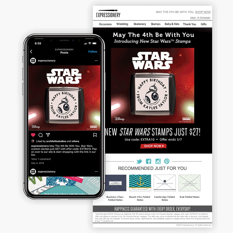
- Email + Web Graphics
Project Info Duration: Sep 2009 – present Client: Harland Clarke, Vericast, Checks in the Mail, iPrint, Expressionery, NDA Role: Graphic Designer Mediums: Photography, Adobe Photoshop I have worked with many stakeholders, clients and teams to create unique, web banners/buckets and email ads, tailored to the specific look/feel and styleguides for each design. I see each as an exciting challenge and opportunity to let my creativity shine. There are many things to consider from color palette, mood, messaging, typography and more. Sometimes the asks are straightforward as a piece of an existing umbrella campaign, and other times it is a complete ground-up task. Research Before layouts or mockup work can commence, it is vital to have a kick-off meeting with stakeholders / marketing team to identify the intended target audience, review marketing personas, discuss inspiration, details, budget, specs and review any precedent pieces from previous campaigns. During this phase, everything from mood boards, to a list of keywords to convey the overall emotion, and inspiration is helpful. Sketching or story boarding If the initial research is enough, I can already begin to formulate a vision in my head for the general direction of the piece(s). Knowing the specs to optimize for is extremely helpful prior to this phase, as I often begin to formulate what type of in-house photography or illustration work will be required for square, vertical or horizontal formats. Feedback With close client and team collaboration, I am able to minimize revisions and and maximize results. In some cases, I have had to communicate with an outside third party such as a legal team for licensed work, or a representative for an original artists consent of use but turn around times for their reviews are typically built into the project timeline up front. Final Deliverables and Lessons Learned Below are a few of the email and web banners/bucket advertisements I have formatted in the past. There is not a perfect equation on how to create web or email graphic, but there are some elements of design that can steer you in the right direction. Most of these pieces have an emphasis on call-to-action (CTA), contrast for ADA compliance, balance, eye-movement, white space, and a basic visual unity for a cohesive look. Disclaimer: The thoughts shared in this blog are solely my own and do not represent the perspectives of my professional relationships or clientele.
- 50 Logo Designs
Project Info Duration: May – Jun 2018 Client: Passion Project Role: Logo Designer Mediums: Pencil, Procreate, Adobe Illustrator To strengthen my logo design skills, I signed up for the Daily Logo Challenge in May 2017. Every day for 50 days, I was emailed a short brief with imagery, name and industry ideas for inspiration. Research I chose to keep these designs in either black and white or one to two colors to focus on shapes, form and typography. I did high level research for designs featuring the same imagery, names or industry and took these thoughts to my sketchbook. Sketching I began with pencil sketches (Procreate sketches for the 2022 refresh) for every brief, and once I felt it was ready enough to be refined as a vector, I used them as an underlay in Adobe Illustrator. Results Below are my results for all 50 logos (39 while I re-work a few!), with the original brief provided. This set was originally completed in 2017, and refreshed in 2022. Lessons Learned With part of my background in print design, I have encountered poorly designed logos that would not reproduce correctly once converted to single color / black and white. There is more to a logo design than a graphic and typography lumped together. Each one is a delicate balance of contrast, emphasis, hierarchy, pattern, white space, and alignments. The Daily Logo Challenge was an insightful exercise and would highly recommend it to sharpen design skills. Disclaimer: The thoughts shared in this blog are solely my own and do not represent the perspectives of my professional relationships or clientele.
- Animal Alphabet Watercolor Illustration
Project Info Duration: Jan 2021 Client: Private Commission Role: Illustration Designer Mediums: Pencil, Ink, Procreate, Watercolor I had always wanted to illustrate the letters of the alphabet, so when I was approached to create this original large-sized piece for a kid’s room, my mind began to race with what I could create. The client wanted to depict a wide array of animals alongside the letters of the alphabet. Dimensions were specified, an earth tone color palette was established, and guidance for the animals was to feature anything appropriate but to also include a few standard farmyard animals as well. This piece was to compliment any age, so that it could be enjoyed as an heirloom into adulthood. Research Research was divided into two phases, followed by a couple rounds of sketch proofs before finalizing. Phase 1: Featured animals Establish a list of 2-3 animals per letter. A mixture of mammals, reptiles, birds, amphibians, inserts and fish were acceptable. For the more difficult letters, it was acceptable to define exact species names. (Prime example is for letter X: Xantus Hummingbird & X-Ray Tetras) Phase 2: Color palette Vary the approved color palette over all letters so the overall look and feel is achieved. By going with 6 established colors from the approved palette across all 26 letters, I could use a wide variation of colors for the animals and not affect the overall feel. Sketching The initial sketches of the letters and animals were done in Procreate for ease of making edits to layout and color. Knowing the final was to be in watercolor, there needed to be an accurate representation of them in Procreate. I did a swatch of every color in my set of Faber-Castell Albrecht Durer Watercolor Pencil set, scanned them, and created an entire brush set library in Procreate to sample from. Feedback Each letter design was done with intention and care. The client collaboration ensured revisions and iterations that made sense and moved the project forward. The carefully curated color palette and list of animals all came together in a pleasing way and after two rounds of proofs, we were all thumbs up to proceed with the final. I printed each letter sketch from Procreate to scale and used my light table to trace onto Arches watercolor paper. Each letter received 2-3 layers of watercolor, and once dried, I traced the outlines and added details to the animals with archival ink. The names of each animal was then hand lettered next to each animal. Final Deliverable The final piece is easy to get lost in while exploring each letter and their details. It continues to be one of the most viewed pieces on my social media. Lessons Learned There is not a perfect equation on how to create a winning illustration, but there are some elements of design that can steer you in the right direction. I learned quite a bit about alignments, proportion, hierarchy, white space, color and what it takes for individual pieces to work together in a cohesive illustration. Disclaimer: The thoughts shared in this blog are solely my own and do not represent the perspectives of my professional relationships or clientele.
- Direct Mail Circulars
Project Info Duration: 2015 – 2018 Client: Harland Clarke, Vericast, Expressionery, iPrint, Checks in the Mail, NDA Role: Graphic Designer Mediums: Photography, Adobe Photoshop, Adobe Illustrator, Adobe InDesign There are typical design elements to consider from color palette, mood, typography and more. It can be quite the cross-team effort to send one to production. Kickoff & Research Direct mail circulars, wraps, coupons, print ads are a marketing strategy tailored to a particular area/location or demographic. They are often combined with many other competitors in the same piece, which makes this method cost-effective, and easy to be a part of. They are usually produced on a very thin/light-weight paper, and is common to see saturated/contrasted colors so the information shows up well. The primary objective is to market a company’s product(s) – typically paired with an offer/coupon, helpful tips or reason to visit the company’s location or website. I find it vital to have a kick-off meeting with stakeholders / marketing team to identify the intended target audience, discuss inspiration, details, specs and review any precedent pieces from previous campaigns. During this phase, information that conveys the overall emotion, and inspiration is helpful. Layout & Sketching I typically begin by laying out all the spec sized pages in Adobe InDesign. Circulars tend to have live areas where coupons on the reverse side may be cut. It is important to refrain from placing too much pertinent information in that area so it is not lost. Sketch layout with safe areas for vital information. I tend to mock these areas out on the pages as “unsafe zones” for promo codes, legal lines, etc. Copy is typically established by the time I get to layout, and I begin to block areas out for headlines and subheads. It may not be exact, but it helps me visual the space left over for photography and/or illustrations. I go to the sketchbooks and begin to thumbnail how the layout might work. Final Deliverables and Lessons Learned It can be all to easy to take print ads and run with them. I have to remember there are multiple teams involved who each have their own vision, it is vital to maintain communication to minimize revisions and maximize results. By designing circulars and wraps, I have learned the importance of communication, copy writing, and even how to package files up for seamless delivery for production. Below are a few circulars / wraps I have formatted in the past. There is not a fail proof method to designing these types of layouts, but there some elements of design I pay attention to are call-to-action (CTA), hierarchy, balance, eye-movement, white space, and a basic visual unity for a cohesive look. Disclaimer: The thoughts shared in this blog are solely my own and do not represent the perspectives of my professional relationships or clientele.
- I Heart Birds Series
Project Info Duration: Jan – Aug 2018 Client: Architette Studios Role: Illustration Designer Mediums: Pencil, Procreate, Adobe Illustrator I began the I Heart Birds series to create a visual lifer list with a focus on learning to be more efficient with my vector work. Research When I am out birding in the field, I always have my camera and some way to take notes either digitally, or on paper. I observe the surrounding environment, and how the bird I am documenting is engaging with it. Some other things to take note of include what the bird is eating or doing, what the weather is like, or what other animals and insects are present. Sketching The photographs I took out in the field are what become the direct underlay for my illustrations of the bird, and the backgrounds are inspired from where and what I observed them doing. The weather also plays into how they are portrayed. The basis for each illustration is either pencil or Procreate, and the finals are vector. Results The I Heart Birds illustration style is simple in color and form, yet detailed in pattern, and posture. The small heart on each one represents the excitement birders feel in adding a new lifer to the list. These illustrations are selling as stickers and buttons very well, as the trend of “put a bird on it” still seems to be strong. Lessons Learned There are elements in design one can use to ensure an illustration is pleasing to the eye. Creating these graphics of birds in the wild have taught me a lot about contrast, balance, proportion, patterns, movement and color. The I Heart Birds series is my most colorful line, and am looking forward to the many more birds on my lifer list to practice with! Further Reading I love reading about the adventures others have as they add birds to their lifer list. In 2015, Noah Stryker went on worldwide expedition with the goal of becoming the first person to see more than half of the world’s birds in one year. He blogged about his daily excursions on the Audubon website and I was enthralled. He wrote a book about his experience entitled “Birding Without Borders”. Disclaimer: The thoughts shared in this blog are solely my own and do not represent the perspectives of my professional relationships or clientele.
- Magazine Advertorials
Project Info Duration: 2015 – 2017 Client: Harland Clarke, Vericast, Expressionery, iPrint Role: Graphic Designer Mediums: Photography, Adobe Photoshop, Adobe Illustrator, Adobe InDesign Designing magazine advertorials feels a tiny bit like product design, but within the realm of graphic design. There are many moving pieces and is a beautiful blend of creative direction, marketing, copywriting, photography and design. There are typical design elements to consider from color palette, mood, messaging, typography and more but really enjoy the cross-team effort to send one to production. Kickoff & Research Advertorials can convey useful info, but the primary objective is to market a company’s product(s). It is vital to have a kick-off meeting with stakeholders / marketing team to identify the intended target audience, review marketing personas, discuss inspiration, details, budget, specs and review any precedent pieces from previous campaigns. During this phase, everything from mood boards, to a list of keywords to convey the overall emotion, and inspiration is helpful. Layout & Sketching I typically begin by laying out the spec sized pages in Adobe InDesign. Having a past issue of the publication the advertorial will be going into is helpful to know where they typically place page numbers, titles, etc. I tend to mock these out on the pages as “unsafe zones” for my creative work. If the copy is already established, we can begin to block those areas out on the page in 10 – 12pt font. They may not be exact, but it helps me visual the space left over for photography and/or illustrations. I go to the sketchbooks and begin to thumbnail how the graphics can work together visually across the page(s). Photography There is a better chance for reader engagement if the piece is in step with the overall look/feel of the publication vs. being ad-heavy. With my background in product photography, I like to bring a more lifestyle/in-use look to the imagery used in advertorials, taking cues from the colors, textures and lighting used throughout. Final Deliverables and Lessons Learned As a designer, it can be all to easy to take advertorial projects and run with it, but with multiple teams involved who each have their own vision, it is vital to maintain close client and team collaboration to minimize revisions and maximize results. I learned so much in my work with advertorials – everything from the importance of collaboration, communication, vision, curated copy writing, and even how to package files up for seamless delivery for production. Below are a few advertorials I have formatted in the past of which I am proud to showcase my own in-house product photography and illustrations. There is not a scientific equation on how to create a winning piece, but there are some elements of design that can steer you in the right direction. Most of these pieces have an emphasis on call-to-action (CTA), hierarchy, balance, eye-movement, white space, and a basic visual unity for a cohesive look. Disclaimer: The thoughts shared in this blog are solely my own and do not represent the perspectives of my professional relationships or clientele.
- Magazine Ads
Project Info Duration: 2015 – 2017 Client: Harland Clarke, Vericast, Expressionery, iPrint, Water2Wine, NDA Role: Graphic Designer Mediums: Photography, Adobe Photoshop, Adobe Illustrator, Adobe InDesign There are typical design elements to consider from color palette, mood, messaging, typography and more but really enjoy the cross-team effort to send one to production. Kickoff & Research It is vital to have a kick-off meeting with stakeholders / marketing team to identify the intended target audience, review marketing personas, discuss inspiration, details, budget, specs and review any precedent pieces from previous campaigns. During this phase, everything from mood boards, to a list of keywords to convey the overall emotion, and inspiration is helpful. Layout & Sketching I typically begin by laying out the spec sized pages in Adobe InDesign. If the copy is already established, I can begin to block those areas out on the page. They may not be in the exact final locations, but it helps me visual the space left over for custom photography and/or illustrations. I go to the sketchbooks and begin to thumbnail the layout(s). Photography There is a better chance for reader engagement if the piece is in step with the overall look/feel of the publication vs. being ad-heavy. With my background in product photography, I like to bring a more lifestyle/in-use look to the imagery, taking cues from the colors, textures and lighting used throughout. Final Deliverables and Lessons Learned It is vital to maintain close client/team collaboration to minimize revisions and maximize results. I learned so much in my work with magazine ads – everything from the importance of collaboration, communication, vision, curated copy writing, and even how to package files up for seamless delivery for production. Below are a few magazine ads I have formatted in the past of which I am proud to showcase my own in-house product photography. There is not a perfect equation on how to create a winning piece, but there are some elements of design that can steer you in the right direction. Most of these pieces have an emphasis on call-to-action (CTA), hierarchy, balance, eye-movement, white space, and a basic visual unity for a cohesive look. Disclaimer: The thoughts shared in this blog are solely my own and do not represent the perspectives of my professional relationships or clientele.
- Direct Mail Postcards and Inserts
Project Info Duration: 2015 – present Client: Harland Clarke, Vericast, Expressionery, iPrint, Checks in the Mail, Hangers Cleaners, NDA Role: Graphic Designer Mediums: Photography, Adobe Photoshop, Adobe Illustrator, Adobe InDesign Kickoff & Research I find it vital to have a kick-off meeting with stakeholders / marketing team to identify the intended target audience, inspiration, specs and review any precedent pieces from previous postcard or insert campaigns. During this phase, information that conveys the overall emotion, and inspiration is helpful. Layout & Sketching I typically begin by laying out all the spec sized pages in Adobe InDesign. I block out the USPS required areas which includes the postage, mailing and return addresses. They are the “unsafe zones” for promo codes, legal lines, etc. If the copy is established, I begin to block areas out for headlines and subheads. It may not be where they will end up in the final, but it helps me visual the space left over for photography and/or illustrations. I go to the sketchbooks and begin to thumbnail how the layout might work. Final Deliverables and Lessons Learned By designing direct mail postcards, I have learned the importance of call-to-action (CTA), hierarchy, balance, eye-movement, white space, and a basic visual unity for a cohesive look. Below are a few of the postcards and inserts I have designed. Disclaimer: The thoughts shared in this blog are solely my own and do not represent the perspectives of my professional relationships or clientele.