WELCOME TO THE BLOG
A collection of musings about everything from art to UX
Disclaimer: The thoughts shared in this blog are solely my own and do not represent the perspectives of my professional relationships or clientele.
23 items found for ""
- Postage stamp spotlight: January statehood birthdays
Here we are with another Stamp Spotlight post, where I curate a themed collection of postage stamps from the archive. In the month of January, seven states were admitted into the union forming the USA. I wanted to share mini-themed collections to celebrate each one. 🥳 Happy January birthday! Georgia: January 2, 1788 - 236 years old Alaska: January 3, 1959 - 65 years old Utah: January 4, 1896 - 128 years old New Mexico: January 6, 1912 - 112 years old Connecticut: January 9, 1788 - 236 years old Michigan: January 26, 1837 - 187 years old Kansas: January 29, 1861 - 163 years old My postage stamp collection FAQs When did you start collecting postage stamps? I inherited my Great Aunt Laverne’s stamp collection. She began by sending loose stamps and eventually sent the main binder. She only collected stamps from the USA, with most being from between the late 1950s to mid-1990s. I now add international issues as well. Do you like postage stamps? I have always been fascinated with postage stamps. Each one is a tiny work of art. Plus, just about every country in the world has them! It's a small window into other cultures and lands. Why curate these postage stamp collections? It took me some time to decide what to do with the collection. I knew I wanted to share the design and stories stamps tell which morphed into curating mini visually themed collections. You can see these collections on my Instagram @collectedstamps How do you come up with the collection themes? My collections are inspired by current events, holidays, weather, mood... or just what inspires me in the moment. Have an idea for a postage stamp theme? Send me a message! Where do you acquire new postage stamps? When curating for a theme, I sometimes realize I am coming up short of stamps to fit the collection. To satisfy the vision, I source new postage stamps via Postcrossing or eBay. Have new or used postage stamps you want donate? Drop me a note! Disclaimer: The thoughts shared in this blog are solely my own and do not represent the perspectives of my professional relationships or clientele.
- Spectacular Solar Showcase: Viewing the 2023 annular eclipse
The much-anticipated annular eclipse passed through San Antonio, Texas on October 14th, 2023. There were many events being held locally and people came from all over the world to witness it here. I was lucky enough to witness this astronomical event from my hometown. I knew my backyard wouldn't provide the best view, so a local pottery shop Just Pots was kind enough to let me set up in wide-open acreage for an unobstructed view of the celestial show. I picked out a spot out of the main flow of customer traffic to set up my camera, ready to document the eclipse. To my surprise, quite a few customers stopped to take a peek at what I was capturing too! I used a solar filter over my camera lens I had bought on online back for the total eclipse in 2017. Sunspots AR3460-3466 made an appearance on the sun's surface, adding an interesting element to the unfolding event. These dark spots created a cool contrast against the backdrop of the eclipse, making the experience even more engaging. Courtesy of the NASA Solar and Heliosphere Observatory (SOHO) As the moon began its journey across the sun, the sunlight dimmed just enough to feel a tad eerie. Viewing the eclipse from this location turned out to be a wise decision. The open space provided an unobstructed view, free from the interference of trees. Surrounded by the down-to-earth atmosphere of the pottery shop and interested customers. Annular eclipse at approximately 11:10am CST As the annular eclipse came to peak, my focus shifted to capturing Baily’s Beads. These "beads" are a result of the sun's light filtering through the moon's mountains, craters and valleys along its edge... creating a captivating play of light and shadow. It was a subtle yet beautiful aspect of the eclipse that added to the overall charm of the moment. The second thing I had to do, was capture a solar selfie! 😉☀️ Viewing the annular eclipse from San Antonio, Texas, was an adventure from the sunspots, to capturing Baily’s Beads, and sharing it with some locals along the way. As I packed up my camera, I already thought ahead to when the next one will cross over this part of Texas again next in April of 2024! I will have to drive a bit to experience totality but it will be worth it! Montage of different stages of the eclipse The fun didn't stop - when I returned home, I realized my Ring security camera caught the most amazing eclipse shadows through the leaves of the trees in my backyard. Just amazing. Ring camera video footage of the annular eclipse shadows Did you capture any photos of the 2023 annular eclipse? I would love to see them. Send me a snapshot! Astrophotography FAQs When did you start observing & photographing the night sky? It is fair to say my first "love" was the night sky and I have many wonderful family memories of taking night roadtrips outside of the city limits to see the heavens better. I started photographing the sky in 2000 when I bought my first SLR camera. What equipment do you use to observe & photograph the night sky? • Canon SX50 HS • Orion 10x50 Wide-angle binoculars • DayStar White-Light Universal Lens Solar Filter • iPhone 12Pro (rare, but it happens!) 😅 What do you suggest for someone wanting to get started in astronomy or astrophotography? Having some basic understanding about celestial objects and the night sky can be super helpful before jumping right in. • For observing the night sky: I suggest reading articles and blogs about current astronomy events. There are many sites which keep calendars of what to expect months and years in advance. Join local astronomy clubs, online groups and forums, and get recommendations for tips and tricks for observing where you live. • For astrophotography: I suggest learning about camera settings, equipment setup, and post-processing techniques to be successful. There are many videos online with tips and tricks for the best settings. Also beware, equipment can get quite pricy! Disclaimer: The thoughts shared in this blog are solely my own and do not represent the perspectives of my professional relationships or clientele.
- Pocket UX case study: Pumpkin carving app
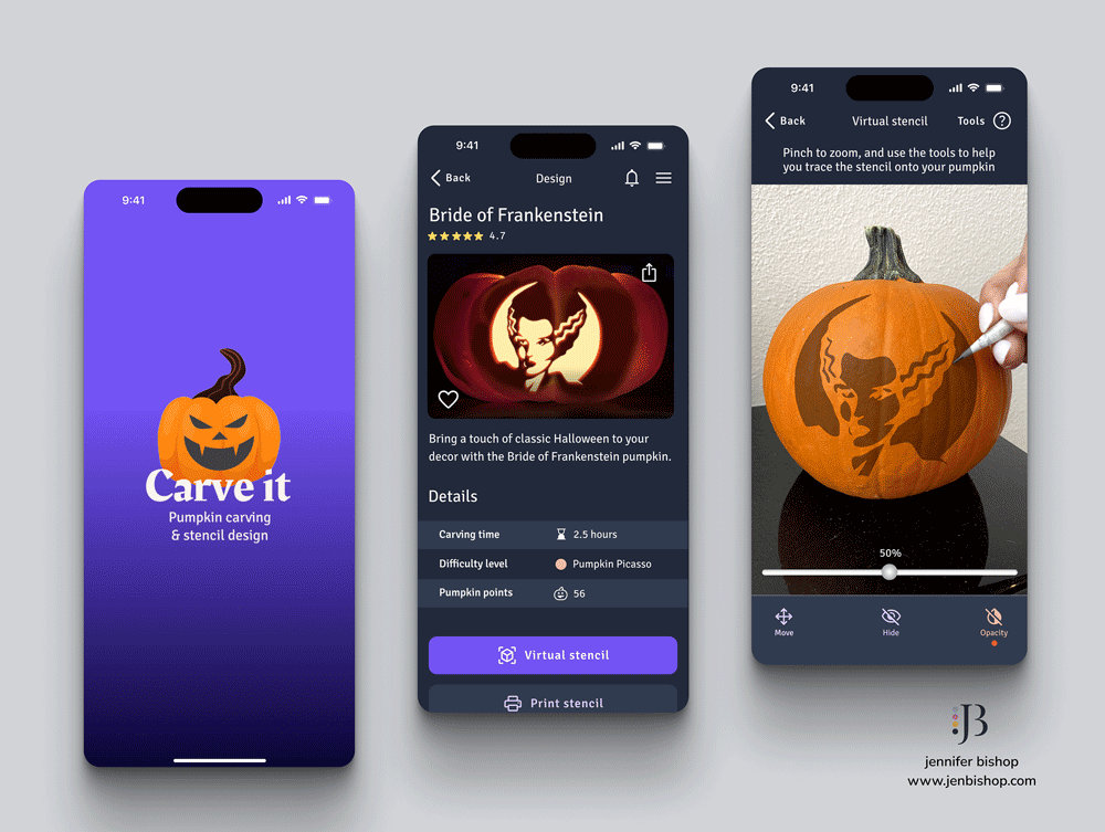
Greetings and welcome to a spine-tingling installment of Pocket UX - Halloween edition! 🎃 👻 🦇 These mini UX/UI app designs are my favorite potion for honing my skills and adding a touch of magic to my craft! Project Info Duration: 2 weeks +/- Concept client: Carve It Role: UX / UI Designer Mediums: Figma, Procreate Problem Statement “How can we better understand the needs and goals of users who are looking to carve a pumpkin for Halloween?” Overview Carve it is a mobile app for those who want to carve a pumpkin but don't know what design to carve, where to buy the tools they need, or need advice on how to preserve their pumpkin after carving. Design Process Before conjuring up screens, research is my cauldron's brew. 👻 Even with the quick, self-imposed turnaround for this UX/UI challenge, following the same overall process structure maximizes my time and effort. Empathize Define Ideate Design / Prototype Test / Feedback 1. Empathize Competitive Analysis Even if Halloween is filled with trick-or-treating and costumes... we still need to pay attention to the competition. 😉 Recognizing the significance of mobile devices in the lives of many, I decided to focus on mobile apps dedicated to pumpkin carving, both in the physical and virtual worlds. *It is worth noting: the last app analyzed was virtual pumpkin carving only. In the app marketplace, I discovered a diverse array of options. However, it was clear only a select few truly excelled to a point where they warranted in-depth analysis. Even within this handful, it became evident that there remained ample room for improvement, highlighting the ever-present potential for enhancing the user experience. User Research and Pain Points First, I analyzed reviews for these apps, then read through reviews on websites, and social media posts about pumpkin carving. This gave me a good foundation to identify "must-have" features. I also posted a multiple choice question and an open answer field on my Instagram stories for quantitative and qualitative feedback surrounding pumpkin carving pain points. Lastly, I also took a peek at some top google searches which came up for pumpkin carving. 2. Define Project Goals After gaining some clarity into user needs and how existing solutions had some missed opportunities, I gathered my research and created a pocket-sized list of project goals. I wanted to: 🎃 Help users find designs they want to carve into their pumpkins 🎃 Guide users to where they can buy pumpkin carving tools 🎃 Give users access to tutorials, tips and tricks on how to preserve their pumpkins Task Flow Given the quick-paced nature of this challenge, I chose to create a high-level flow for various features in the app. I also used icons to represent user touch points which would most likely occur outside/beyond the app. 3. Ideate Sketches / Wireframing I just LOVE sketching in Procreate on my iPad for screen designs. The ability to draw on multiple layers, fill in blocks of grey, and import supporting graphics are just to name a few reasons! They absolutely become the blueprint for the final UI. I broke down my sketches into mini, high-level steps to support the project goals: 🎃 Help users find designs they want to carve into their pumpkins Design library --> individual pumpkin design Virtual stencil projection and tools via the users camera Design style quiz 🎃 Guide users to where they can buy pumpkin carving tools Using maps to search for pumpkin carving tools locally and/or online 🎃 Give users access to tutorials, tips and tricks on how to preserve their pumpkins Video tutorial library --> individual course And then I sprinkled in these screens for context Sign in / sign up Splash screen Home Screen 4. Design / Prototype UI Kit / Mini Style Guide Hold onto your broomsticks because this is my first design in dark mode! 🖤 Not only does dark mode serve as an enchanting canvas for the vibrant pumpkin designs to take center stage, but it's also has that eerie Halloween vibe! 🎃 Logo design: cycles through various faces to support the idea of the app helping one find their design Typography: simple with only two styles: Rakkas for display and Signika Negative for everything else Iconography: outlined style to support the idea that this app is for tracing, designing and carving a pumpkin up! Color palette: leans heavily to shades of purple, as it is a natural complementary color to pumpkin orange which will be predominantly present throughout the pp Hi-fi screens The following screens were built in Figma for iOS language. 5. Test / Feedback I posted this project online for feedback surrounding the UI, and am in the middle of usability testing with a small group of volunteer users. Excited to see what insights we find! Results & Lessons Learned This pocket-sized product design exercise came with its own set of challenges (mainly time!). I’d like to explore the AR feature a little more to understand how one could place a virtual stencil on a rounded surface - if it is even possible! I'd also like to explore if there is a developer out there who'd maybe take this app on as a collaboration app to launch, since there's nothing else like it out there as of now. In any case, this hauntingly fun adventure has been a real scream, and I bid you adieu until our next spine-chilling rendezvous. Until then, may the spirits of design guide you! 👻🕸️🎃 Graphic attributions: Freepik, Vecteezy 1, 2, 3 and 4 Unsplash 1, 2, 3, 4, 5, 6 and 7 Disclaimer: The thoughts shared in this blog are solely my own and do not represent the perspectives of my professional relationships or clientele.
- Postage stamp spotlight: Fires of philately
Here we are with another Postage Stamp Spotlight, where I curate a themed collection of postage stamps from the archive. This set of postage stamps is called Fires of Philately. Featured left to right: Forest fire prevention - Germany - 1958 Sun science - USA - 2022 Solar energy - USA - 1982 Prevent fires - Canada - 1956 Energy Development - USA 1977 International Geophysical year - USA - 1958 Hekla Volcano - Iceland - 1954 Emergency responder - Canada - 2018 Saguaro cactus - USA - 1999 It feels like these will ignite soon… so I’ll get to the point. It’s HOT outside. It’s the end of summer, but the heat hits different this year. It’s a mean heat.. a heat making sure everyone feels it and remembers it. 🔥 No matter where you are in the world, or what beliefs you have about what's causing it... it's true that the news headlines include flavors of global warming, climate change, heatwaves and droughts. This collection entitled "Fires of Philately" is inspired by these current events which are affecting us all. Have an idea for a postage stamp theme? Send me a message! My postage stamp collection FAQs When did you start collecting postage stamps? I inherited my Great Aunt Laverne’s stamp collection. She began by sending loose stamps and eventually sent the main binder. She only collected stamps from the USA, with most being from between the late 1950s to mid-1990s. I now add international issues as well. Do you like postage stamps? I have always been fascinated with postage stamps. Each one is a tiny work of art. Plus, just about every country in the world has them! It's a small window into other cultures and lands. Why curate these postage stamp collections? It took me some time to decide what to do with the collection. I knew I wanted to share the design and stories stamps tell which morphed into curating mini visually themed collections. You can see these collections on my Instagram @collectedstamps How do you come up with the collection themes? My collections are inspired by current events, holidays, weather, mood... or just what inspires me in the moment. Have an idea for a postage stamp theme? Send me a message! Where do you acquire new postage stamps? When curating for a theme, I sometimes realize I am coming up short of stamps to fit the collection. To satisfy the vision, I source new postage stamps via Postcrossing or eBay. Have new or used postage stamps you want donate? Drop me a note! Disclaimer: The thoughts shared in this blog are solely my own and do not represent the perspectives of my professional relationships or clientele.
- Astrophotography: Sturgeon moon 2023
One of the advantages to living on the third floor of a building in a hilly part of San Antonio, Texas is the view! This is the view from my balcony as the 2023 Sturgeon full moon rose in the east. It has been unbelievably hot here this year. I've never seen the temperatures this high in all my years of being in San Antonio. The amount of heat the earth belches back into the atmosphere at night, interferes with how crisp I can see the moon near the horizon... but I am pleased with how this photo turned out. It will most likely be the second to the last full moon I see rise from this apartment as we are moving in a couple weeks. 🌝 Have you taken a lunar photo recently? I would love to see it. Send me a snapshot! Astrophotography FAQs When did you start observing & photographing the night sky? It is fair to say my first "love" was the night sky and I have many wonderful family memories of taking night roadtrips outside of the city limits to see the heavens better. I started photographing the sky in 2000 when I bought my first SLR camera. What equipment do you use to observe & photograph the night sky? • Canon SX50 HS • Orion 10x50 Wide-angle binoculars • iPhone 12Pro (rare, but it happens!) 😅 What do you suggest for someone wanting to get started in astronomy or astrophotography? Having some basic understanding about celestial objects and the night sky can be super helpful before jumping right in. • For observing the night sky: I suggest reading articles and blogs about current astronomy events. There are many sites which keep calendars of what to expect months and years in advance. Join local astronomy clubs, online groups and forums, and get recommendations for tips and tricks for observing where you live. • For astrophotography: I suggest learning about camera settings, equipment setup, and post-processing techniques to be successful. There are many videos online with tips and tricks for the best settings. Also beware, equipment can get quite pricy! Disclaimer: The thoughts shared in this blog are solely my own and do not represent the perspectives of my professional relationships or clientele.
- Postage stamp spotlight: Earth day
Here we are with another Stamp Spotlight post, where I curate a themed collection of postage stamps from the archive. This set of stamps is in honor of the 53rd anniversary of Earth Day. From the middle to top left, clockwise: Space Exploration: Earth - USA - 1991 Celebrate the Century - USA - 1999 Save our Air - USA - 1970 Apollo 8: Moon Orbit - USA - 1969 Earth - USA - 1988 Atoms for Peace - USA - 1955 Global Forever - USA - 2013 Earth Day is a day we dedicate ourselves to raising awareness about environmental protection and sustainability. It serves as a reminder of the importance of preserving the place we all call home. Curating this collection of postage stamps is my creative way to honor Earth Day. Have an idea for a postage stamp theme? Send me a message! My postage stamp collection FAQs When did you start collecting postage stamps? I inherited my Great Aunt Laverne’s stamp collection. She began by sending loose stamps and eventually sent the main binder. She only collected stamps from the USA, with most being from between the late 1950s to mid-1990s. I now add international issues as well. Do you like postage stamps? I have always been fascinated with postage stamps. Each one is a tiny work of art. Plus, just about every country in the world has them! It's a small window into other cultures and lands. Why curate these postage stamp collections? It took me some time to decide what to do with the collection. I knew I wanted to share the design and stories stamps tell which morphed into curating mini visually themed collections. You can see these collections on my Instagram @collectedstamps How do you come up with the collection themes? My collections are inspired by current events, holidays, weather, mood... or just what inspires me in the moment. Have an idea for a postage stamp theme? Send me a message! Where do you acquire new postage stamps? When curating for a theme, I sometimes realize I am coming up short of stamps to fit the collection. To satisfy the vision, I source new postage stamps via Postcrossing or eBay. Have new or used postage stamps you want donate? Drop me a note! Disclaimer: The thoughts shared in this blog are solely my own and do not represent the perspectives of my professional relationships or clientele.
- Isometric chunk drawing: Sheeptails comic edition
It's a little throwback to isometric drawing during my days of architecture school. (I'd have loved to have an iPad Pro, Apple Pencil and the Procreate app back then! My productivity would have been epic!) This isometric land chunk features our friends from my much neglected Sheeptails comic series. I will be honest in saying I was lacking the vision to create new Sheeptails illustrations so I asked ChatGPT to give me a list of drawing prompts in the hopes it would inspire. 🤖 It worked! The list it created also gave me inspiration for other land chunks in the future! Have a fun idea for an isometric chunk? Drop me a note about it. FAQs about Sheeptails What is Sheeptails? Sheeptails was born in 2005 while I was studying architecture at Pratt Institute in New York City. I would sketch and doodle comic strips populated with sheep doing cute and funny things. Back when I maintained a blog on Xanga, the posts featuring Sheeptails always did the best. Do you sell artwork featuring Sheeptails? There are plans to in the near future! Stay tuned. Does Sheeptails have it's own website? Not at the moment but am thinking about doing so later down the line. Disclaimer: The thoughts shared in this blog are solely my own and do not represent the perspectives of my professional relationships or clientele.
- Postage stamp spotlight: Winter feels
Here we are with another Stamp Spotlight post, where I curate a themed collection of postage stamps from the archive. Happy December! We're feelin' you winter! ❄️🥶🌬️This set of stamps is inspired by the low temps outside. From the middle to top left, clockwise: Moose - USA - 1978 Save Mountain Habitats - USA - 1981 White House Conference on Aging - USA - 1971 Arctic Animals: Arctic Fox - USA - 1999 Polar Lights: Aurora Australis - USA - 2007 VIII Olympic Winter Games - USA - 1960 It was nice to stay inside where it is warm and cozy - and take out the stamp collection and see if I could find a winter theme. This curated collection of stamps is your reminder to bundle up and stay warm. ☕️ Have an idea for a postage stamp theme? Send me a message! My postage stamp collection FAQs When did you start collecting postage stamps? I inherited my Great Aunt Laverne’s stamp collection. She began by sending loose stamps and eventually sent the main binder. She only collected stamps from the USA, with most being from between the late 1950s to mid-1990s. I now add international issues as well. Do you like postage stamps? I have always been fascinated with postage stamps. Each one is a tiny work of art. Plus, just about every country in the world has them! It's a small window into other cultures and lands. Why curate these postage stamp collections? It took me some time to decide what to do with the collection. I knew I wanted to share the design and stories stamps tell which morphed into curating mini visually themed collections. You can see these collections on my Instagram @collectedstamps How do you come up with the collection themes? My collections are inspired by current events, holidays, weather, mood... or just what inspires me in the moment. Have an idea for a postage stamp theme? Send me a message! Where do you acquire new postage stamps? When curating for a theme, I sometimes realize I am coming up short of stamps to fit the collection. To satisfy the vision, I source new postage stamps via Postcrossing or eBay. Have new or used postage stamps you want donate? Drop me a note! Disclaimer: The thoughts shared in this blog are solely my own and do not represent the perspectives of my professional relationships or clientele.
- Pocket UX case study: Limited resources finder app
Hello and welcome to another Pocket UX post. These mini UX/UI app designs are just for fun and to keep my skills sharp! Amid a supply chain shortage, Sparesource comes to the rescue! 🛟 Easily discover essential, in-stock supplies at the local, regional or global level with the app. Project info Duration: 2-3 days +/- Concept client: Sparesource Role: UX / UI Designer Mediums: Figma, Procreate Problem Statement “When global issues arise, I want to see which resources are becoming scarce, so I can prepare by planning ahead.” Overview Sparesource helps users discover what local, regional and global resource shortages are being reported. Sparesource allows a small peek into the supply chain and how these resource scarcities might effect users. Design Process Empathize Define Ideate Design / Prototype Test / Feedback ★ Empathize Competitive Analysis When I began to research how a crisis can effect the global supply chain, I found myself wanting to solve for helping a user find limited resources locally, with a high level view into regional and global reports. There are professionals who dedicate their whole lives to tackling humanities greatest challenges and push global progress forward. I’d argue to say there are no “competitors” in the heart of this field… and rather see us all on the same team. I looked to a few existing solutions which help users find the services they need to improve their life circumstances. My solution only scratches the surface and would love to revisit with later iterations and deeper analysis into the user base on all levels. Please consider learning about and donating to help these hard working entities continue to do what they do! https://oclawin.org https://www.1degree.org User Research and Pain Points While the solutions analyzed solve for humanitarian services, I applied the same needs and desires from these users to the search for limited resources. In reading reviews, I was able to build a good foundation to identify must-have features. User Persona This lightweight user persona is based on my high-level research findings, to quickly align who the users might be, and what they need. ★ Define Project Goals After gaining some clarity into user needs and how existing apps addressed similar situations, I gathered my research and created a quick list of project goals. I wanted the user (Ray Resource) to be able to: see how limited resources were effecting his local community see both the macro and micro levels of limited resources as a map and list view, view report details, view last update times, and have the ability to be alerted when the issue is resolved. use a light-weight, native OS app Task Flow Due to the fast-paced nature of this challenge, I chose to create a high-level flow for the specific task of signing in, allowing location permissions, viewing local resource reports, and being able to zoom out to the global level. ★ Ideate Sketches / Wireframing I had a few ideas for screens outside of the established task flow, but ultimately chose to move forward with the sketches necessary to convey the goal of the original task completely. ★ Design / Prototype UI Kit / Mini Style Guide I wanted to give the feeling of calm and safety – keeping within shades of blue. I drew inspiration from images of our blue planet and it’s bountiful resources and nature. I had designed the logo as a location pin, with the globe inside a magnifying glass. Hi-fi screens The following screens were built in Figma for iOS language. ★ Test / Feedback I posted this project online for feedback surrounding the UI and usability and the final screens took this feedback into account. Results & Lessons Learned Overall, this exercise was really eye-opening for me. It came with its own set of challenges which set me out on the hunt for more information. I’d love to revisit this project in the future to gather more feedback, build out more screens and of course… research… and more research. Forever learning. Disclaimer: The thoughts shared in this blog are solely my own and do not represent the perspectives of my professional relationships or clientele.
- Sheeptails comic: Onigiri
It's time to pack a snack... onigiri style. 🍙 Sheeptails is tantalizing my tastebuds in this onigiri food-themed style. My sister Karen lives in Austin, Texas near a huge asian market which has all sorts of onigiri in different flavors. Not going to lie - I am jealous about that! In the meantime, sketching these will have to do! 🐑 🍙 FAQs about Sheeptails What is Sheeptails? Sheeptails was born in 2005 while I was studying architecture at Pratt Institute in New York City. I would sketch and doodle comic strips populated with sheep doing cute and funny things. Back when I maintained a blog on Xanga, the posts featuring Sheeptails always did the best. Do you sell artwork featuring Sheeptails? There are plans to in the near future! Stay tuned. Does Sheeptails have it's own website? Not at the moment but am thinking about doing so later down the line. Disclaimer: The thoughts shared in this blog are solely my own and do not represent the perspectives of my professional relationships or clientele.
- Pocket UX case study: Solar energy consumption app
Hello and welcome to another Pocket UX post. These mini UX/UI app designs are just for fun and to keep my skills sharp! Solarbee is a mobile app which syncs with your home solar array to give a live data feed of energy production and consumption Project Info Duration: 2-3 days +/- Concept client: Solarbee Role: UX / UI Designer Mediums: Figma, Procreate Problem Statement “When I install solar on my home, I want to be able to see how much energy I am producing as well as how that energy is being used, so I can be informed when reducing my consumption.” Overview Solarbee is a smart-home device added to your solar array to give live data about solar energy production and home consumption. It’s no secret solar is the most abundant energy source on Earth, but there are on-going challenges home owners must overcome to harness it. One of the greatest hurdles is to simply know how much solar energy is coming in, and how much is going out. Design Process Before a sketch hits the paper, or a pixel ends up on screen, research is key. Even with the quick turnaround for this product design challenge, following the same overall process structure will maximize time and effort spent in the long run. Empathize Define Ideate Design / Prototype Test / Feedback ★ Empathize Competitive Analysis The sun is the largest entity in our solar system but, it’s still important to pay attention to the competition. 😉 I began by studying competitors to learn how they might handle the influx of data. There were quite a few solutions to learn from and I created a list of features users might appreciate. Further analysis of the user base would be helpful here for a later iteration. User Research and Pain Points I analyzed reviews for various apps which gave me a good foundation to identify must-have features. Most importantly, I was able to see users preferred to see both production and consumption in real time. There were many complaints about the lack of date for incoming vs. outgoing energy. ★ Define Project Goals After gaining some clarity into user needs and how existing apps had flaws to address, I gathered my research and created a pocket-sized list of project goals. I wanted to: Create a clear option to see energy production and consumption Build a multi-view option of data visualizations Show tips / savings / recommendations for consumption Task Flow Due to the quick-paced nature of this product design challenge, I chose to create a high-level flow for the specific task of viewing consumption details around appliances. ★ Ideate Sketches / Wireframing I had a few ideas for data visualization in the form of line graphs, pie charts, etc. as well as screens outside of the established task flow, but ultimately chose to move forward with the sketches necessary to convey the original goal of the task completely. ★ Design / Prototype UI Kit / Mini Style Guide In my research for comparable visuals, I noticed many glamorized UIs designed exclusively for dark mode. While dark mode leads to some sultry visual eye candy, I chose to go the lighter and brighter route – like a summer day. ☀️ I drew my inspiration from bumblebees and honeybees – on the hunt for energy to bring back to the hive during the bright and sunny daylight hours. The logo is a blend of the sun and a bee, which lent itself well to the components throughout the UI. Hi-fi screens The following screens were built in Figma for iOS language. ★ Test / Feedback I posted this project online for feedback surrounding the UI and usability and specifically love this feedback about a previous iteration using line graphs. It was a bit heavy on cognitive load and later swapped this representation with a simplified pie chart for clarity. Results & Lessons Learned This pocket-sized product design exercise came with its own set of challenges which I’d love to revisit in the future sometime. I’d like to explore data visualization in more depth and to gather more feedback, on how they are received on the user end. Forever learning. ☀️ Disclaimer: The thoughts shared in this blog are solely my own and do not represent the perspectives of my professional relationships or clientele.
- Pocket UX case study: Common UX component studies
Project info Duration: 3hrs +/- per element Client: Passion Project *Special thanks to Daily UI Challenge for element ideas. Role: Visual / UI Designer Mediums: Figma, Procreate, Photoshop To understand the user-centered reasons behind crucial UI elements in product design, I decided to study each in pocket-sized pieces. I have grouped handfuls of elements together with similar branding I had previously developed to lessen branding work. I will add these pocket-sized studies as I complete them – stay tuned! Research For each UI element, I research best practices in existing designs, current trends and find what has proven to be tried-and-true… often looking for design patterns on Mobbin, Behance and Dribbble. I take my research and ideas to the iPad and list everything required, breakdown the hierarchy, and plan how many screens it will take to convey my design completely. Wireframe Sketches Each UI element begins as a wireframe sketch in Procreate as it allows for the layering I need to move/shift things around. Once I feel it’s ready enough to be refined, I use them as underlays in Figma, Sketch or Adobe XD. Results & Lessons Learned There are many principles one must apply in UI design besides color and typography. One also needs to address hierarchy, alignment, white space, proximity & grouping and to check for consistency across all elements. In addition, I pay extra special attention to my layouts being responsive for multiple sized devices, and also ensure all designs are inclusive and address accessibility through color choices and mindful microcopy and UX writing. (I recommend taking all of Dr. Katharina Grimm’s UX writing courses on Skillshare if interested. They helped immensely.) These quick pocket-sized UI element studies are insightful and would highly recommend trying it to sharpen design skills. 11 Flash Messages Pocket-sized takeaway: • Flash messages are useful in UX to help lessen the users confusion, and can offer immediate feedback to actions. There are varying levels of importance which could be classified as low, medium or high. Low: badges, status, success – allows the user to move forward Medium: acknowledgements, warnings – allows the user to move forward with caution High: alert, exceptions, errors – allows the user to move forward once an action is taken 10 Social Share Pocket-sized takeaway: • As the user, they may want to share beyond the options given. Including a “more” option gives them this ability. 09 Music Player Pocket-sized takeaway: • The features in the “Now Playing” screen should be influenced by what the overall user experience of the app is geared towards. For example, if it is designed for sleep sounds, a timer might need to be present. If it is designed towards sharing tracks, social share might need to be prominent. 08 404 Page Pocket-sized takeaway: • Cut the navigation down to keep the user focused on getting back on track. • Ending up on a 404 page is never pleasant, but could end up being a brand ambassador if it’s the first page they see. Keep the tone/voice on brand, and the copy clear, kind & simple. 07 Settings Pocket-sized takeaway: • Group similar items together for easy scrolling. • Use clear titles and pair with an icon if it helps the user identify a setting quicker. 06 User Profile Pocket-sized takeaway: • The bottom tab bar should have no more than 5 destinations and it’s important to show which one is active. • Using layout columns while designing is crucial for the alignment of many elements. 05 App Icon Pocket-sized takeaway: • App icon rules are different for iOS and Android. • Avoid using text in app icons as it is usually rendered illegible. 04 Calculator Pocket-sized takeaway: • Micro copy is important for guiding the user when there are multiple fields/inputs. 03 Landing Page Pocket-sized takeaway: • Landing pages are different than homepages. The goal of a landing page is to convert users into customers. • Cutting the navigation down will keep a user focused on conversion. 02 Credit Card Checkout Pocket-sized takeaway: • Keeping screen titles concise and clear of other elements lessens cognitive load. • Having multiple payment options lessens the chance of a customer leaving the checkout flow. 01 Sign Up Pocket-sized takeaway: • Signup screens are different from login screens. Signup identifies you as a new user whereas login describes you as a returning user. • Importance of retaining field labels even when information is entered. Disclaimer: The thoughts shared in this blog are solely my own and do not represent the perspectives of my professional relationships or clientele.